Short tips on how to make your landing page more effective
The goal of a landing page is simple — to convert its visitors.
The most effective landing pages reach conversion rates of up to 27.4%, although an average conversion rate for the majority of the industries moves somewhere between 2 to 6%.
However, if your landing page doesn’t convert well, it doesn’t necessarily mean your product or service isn’t good enough. You simply might be using wrong or insufficient tactics that make people abandon your page before seeing your offer.
To make everything right and promote yourself in the best way possible, use the following nine strategies.
Always use AMP
AMP (accelerated mobile pages) are web pages that load quickly on mobile browsers. In 2021, more than 54% of global website traffic comes from mobile devices (excluding tablets), so having your pages optimized for this type of traffic is essential.
Just a one-second delay in page loading time can decrease your conversion rate by 7%. Thus, without using AMP, you might be losing $700 out of each $10k you make.
AMP significantly boosts conversions, improves ad performance, and decreases your page’s bounce rate.
- Create your first AMP page or learn more with Google Ad guide
Add social proof
89% of people read the reviews before buying a product or service, and 79% of customers say they trust online reviews as much as personal recommendations.
You don’t have to use all social proves mentioned below— pick one that suits your business the most:
- customer reviews and testimonials
- experts’ endorsements
- having “As Seen In” section highlighting product media mentions
- awards or rankings
- any statistics that improve your brand’s image (95% of customers would repeat this purchase, etc.)
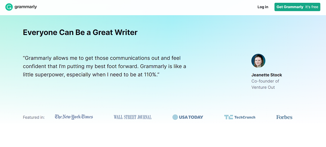
As an illustration, the Grammarly landing page has a section highlighting the most prominent companies that use their service.

Create a video
According to Cisco, in 2021, videos present 80% of all internet traffic.
Using a video on your landing page can help you increase conversions as our brains process visuals faster than text.
Aim to explain the product’s purpose and benefits in less than 3 minutes — ideally in 1 minute. Put it in a logical order and avoid unnecessary information.
Answer potential objections
Always strive to answer objections within the copy. Everything that might cause doubts or distrust has to be clarified in the proposal on your landing page.
Use questionnaires to gather data about customers’ feelings and thoughts. Learn what are their preferences or why they hesitate to buy from you.
People are busy and won’t do you favors for free, so reward their answers with an e-book, short course, or free samples. Then, use the gathered data to create a copy/video that covers answers to all potential objections and fears.
Keep it silly & simple
Make a clear, easy-to-read copy optimized for mobile devices and avoid words with multiple meanings.
Whether it is text or video, every word needs to have its purpose.
Besides the content itself, the landing page shouldn’t contain anything that draws attention from the product/service. Get rid of extra form fields, irrelevant content, buttons, or sections like “articles you might like”.
Don’t send people away from your offer.
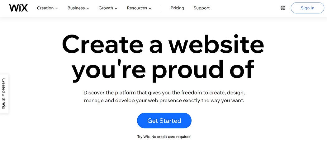
A great example is the Wix landing page. Title with the main idea, subtitle with explanation, and clear CTA button.

Use negative words in headlines
A study published in Outbrain reports that negative headlines work better than positive ones.
After title analysis, they found that headlines containing negative words never or worst performed 30% better than headlines with positive words always or best.
The average CTR on negative headlines was 63% higher than on positive headlines.
Grab attention with the title and clearly state what’s your offer. Everything else can be said in the subtitle.
First engage, then pitch
If you have a landing page to generate new subscribers, using a quiz is a great way to increase conversions. Engage with people by asking them simple questions related to your niche and their goals.
At the end of the quiz, ask for their email address to send them the results, e-book, or anything you offer.
The logic beyond this strategy is simple: when visitors take their time to fill the quiz, they will also spend two more seconds entering their emails as well. Without the quiz, the likelihood of them leaving without giving you the email address is significantly higher.
In one of his videos, Neil Patel explains how using a simple quiz on his former website Nutrition Secrets increased the conversions rate by 108.3%.
- An easy and cheap solution for quizzes on your page can be ConvertFlow or LeadQuizzes.
Mention the loss, not just the gain
The landing page usually highlights the benefits of the product, service, or newsletter. However, it often forgets to mention what people can lose by not buying or signing up.
That’s a lost opportunity because people prefer avoiding losses over acquiring gains. This phenomenon is called loss aversion and is dominant in the field of economics.
You can make use of this psychological principle by pointing out the negative effects on a customer’s life, well-being, or business by not opting in for your offer.
A simple example of this can be a product page with organic cosmetics. Pointing out that using non-organic products loaded with chemicals harms the skin and makes your face look older.
The loss of attractiveness can easily convince women to reach out for your products.
Focus on one thing at the time
Promoting multiple products on one page can be a tempting move to sell more, but in reality, it doesn’t always work. The more options you give, the more confused people become.
Thus, make sure your landing page focuses on the promotion of only one product or service.
Targeting a specific goal will increase conversions and give you the ability to track the product/service success better because it’s isolated from the rest of your offers and content.
Conclusion
To make your landing page efficient,
- Optimize your page for mobile browsers.
- Add social proof that resonates the most with your audience.
- Use a video to spare people from reading.
- Always answer potential objections within the landing page copy.
- Keep things simple, and don’t send people away by promoting unrelated stuff.
- Use negative headlines as they tend to perform better than positive ones.
- Try to engage with people before you pitch them your offer.
- Don’t say only what people gain by purchasing your product or service, say what they will lose if they decide to leave your page.
- Make sure your landing page promotes one specific item.